Sep 28 2008
A JustRite Autumn Wedding
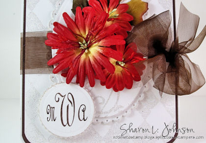
This evening I made a card for our niece’s wedding which will be next Saturday. An October wedding. Her dress is white and her bridesmaids will be wearing brown. The flowers will be in fall colors with leafy accents about, so that’s what I tried to capture. Quite honestly, these colors just were not doing it for me in terms of a wedding card,but afterI decided to add lots of glitz and sparkle, then it seemed to work, and I really do like the end result!!! Here it is:

I’ll take this layer by layer — the bottom layer is stamped with Versa Mark inSU’s background called Print Pattern, embossed with Iridescent Ice. The solidoval is my favorite piece and you can hardly see it under the flowers. It is stamped in Versa Mark and embossed with Iridescent Ice as well, using Baroque Motifs (those gorgeous swirls)! It is framed in a scalloped oval (all done with the Nestabilities). I pierced each scallop, then I kind of rolled the edges over my Versa Mark pad and embossed them with the Iridescent Ice as well. The flowers are Daisy Doodle Primas and the leaf is in a bag from Michaels. Here’s a close-up so you can see all the detail a bit better:

The new couple’s monogram was done with the Special Occasion Monogram Stamper Kit by JustRite. Monogram etiquette dictates that when you monogram the initials of a married couple, the woman’s initial is on the left, the last name is in the center, and the man’s initial is on the right. This is for Maria and Andrew W. The monogram was cut with the Nestabilites again and it is narrowly bordered with a scallop, which was also embossed as above.
There is something I want to explain to you about doing this monogram. I’ve done a lot of monograms with the JustRite products, and I’ve never encountered this before, but I’m sure it is likely to happen again, just depending on the combination of initials used. When I just put my MWA onto the stamper and stamped, it was really off balance. Check these photos to see what I mean:
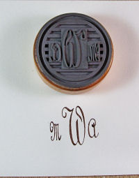
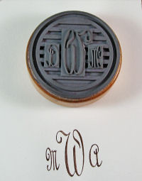
See the first photo. Letters are on the stamper as usual, and look how it stamps — really off balance. I could not move the M any closer, so I tried to move the A further away, and that kind of worked in this situation as I was NOT using a ring border. If I were going to use a ring border, then it would have been off balance within the border. And if you look closely at the W, you can see the problem. It is kind of off to one side on the rubber because of the huge swirly on its upper tail (real official terms here — LOL!). Anyway, to fix the problem permanently, I just cut away the rubber on the W under that swirly, allowing me to push my M closer in to balance it all out properly.Refer tophoto 2. See hownicely itnow stamped? Easily done, problem solved. And the moral of this story is — IT IS OK TO CUT YOUR RUBBER!!!
-
Stamps: Baroque Motifs and Print Pattern by SU. Special Occasions Monogram Stamper Kit by JustRite.
-
Paper: PTI White, SU Chocolate Chip.
-
Ink: Versa Mark, SU Chocolate Chip.
-
Accessories: Petite Oval and Petite Circle Nestabilities by Spellbinders, SU Corner Rounder, Iridescent Ice Embossing Powder, Chocolate Sheer Ribbon, Daisy Doodle Primas, Leaf from Michaels, Piercer and Mat Pack, Zots, Pop Dots, Mounting Tape
And that’s it for tonight’s project!!! Nice to have my wedding card done almost a week in advance — for me, that’s REAL GOOD!!! LOL!!! Hope you are all off to a good week!!! As always, thank you so much for stopping in!!!
34 responses so far


Wowza!! I would not have expected to like these colors on a wedding card either Sharon, BUT I REALLY DO!!! I think you have added enough sparkle and glamor to the card to make it work! The black layer and that gorgeous ribbon really balances everything out. Beautiful!!
smiles,Deena
I agree the fall wedding colors are harder to work with but this is gorgeous and thank you so much for the cutting idea, I just got this stuff and would not have thought to cut it out.
Sharon, you certainly know how to do it. Great card for this wedding and so nice that you can do it in their colors. It looks terrific.
I had the same problem with my monogram yesterday, but unlike you did not know how to fix it. Thanks for that tip.
Joan
Beautiful card! Love the white background with the gorgeous flowers. TFS!
Very pretty card and such a wonderful design for a Fall wedding. Thanks for sharing the tip about adjusting the letters.
Oh Sharon, you are always SO clever … this wedding card is gorgeous as I’m sure the wedding itself will be! Thanks for the tip on the monogramming … I’m sure it will come in handy to many of us!!
Beautiful card, Sharon…Never would have thought to emboss that bg stamp but what lovely results! Thanks for the JRS tip, too!
I love all the sparkling embossing, and the fall colors! Muah…beautiful.
I ran into the same problem with one of my monogram stamps, and I trimmed the letters to fit. Almost felt guilty, but like you said, it’s okay…. 🙂
WOW! This is beautiful!
Oh My Goodness, this is one elegant and special wedding card! I love the glittery embossing – that looks so stunning! The fall flowers and brown ribbon are the perfect compliment and I’m sure your niece will treasure this card forever! Great tips on the JRS monogram too – I’d have never thought of doing that!
Thanks for the great tip.
Your card is beautiful Sharon. Thanks for the background ideas. I also had the same problem and was afraid to cut the rubber but did it and the monogram looked much better.
This is such a gorgeous card! Love the corsage of fall colors and the lovely sheer ribbon! Another winner!!!
Oh wow, this is absolutely gorgeous!!! I love it!
WOW! That is absolutely GORGEOUS!!!!!!!
This is another gorgeous one, Sharon! You really rocked the autumn colors for this beautiful wedding card – stunning! Great way to fix the monogram issue, too. :O)
It turned out very elegant Sharon. My anniversary is Oct. 1st, so it hits home w/ me! Have fun at the wedding, I am sure they will treasure your card.
This is GORGEOUS!!
Oh, Sharon, what a lovely wedding card!! Love the sparkle, the layout and love those gorgeous flowers which look like a bouquet on the oval, all tied up with a super pretty bow!
Hi Sharon,
What a beautiful card – one to treasure. I love the colors. Also loved your tip about trimming rubber if necessary. I have been trimming the rubber on stamps for years if needed to avoid the ‘shadow line’ which can sometimes occur on stamps with an overly generous border. I call it a ‘rubberectomy’ lol.
Anne.
Gorgeous card Sharon, your niece is going to be so happy to receive such a beautifu wedding card. Her colors will be beautiful! The small tutorial is helpful as well, I ran into that problem and trimmed mine for a symmetrical fit.
WOW!! This is gorgeous, Sharon!! Beautiful for a Fall wedding card. Love the Iridecent Ice, the contrast between the flowers and the white, and the simplely elegant design. They’re gonna love it! Have fun! 🙂
Sharon this turned out absolutely beautiful!! The fall colors ae gorgeous…
Have fun at the wedding.
This is beautiful. I LOVE the bkgd. and the colors are fabulous.
Beautiful card Sharon!! And good to know about the stamper!
So very beautiful! What a gorgeous wedding card– just perfect for an October wedding!
Oh my, my, my! This is the ultimate in exquisite and loveliness, Sharon! So beautiful!
This is gorgeous, Sharon!! I LOVE every element of it, from your background, to your beautiful flowers, to your elegant monogram!! Thank you for the letter placement tip too!! I will be sure to pay attention to that in the future!!
The monogram is great! I need to try that with my JustRite set.
One question: Will you put this card in an envelope? I always wonder about that when I see fancy embellished cards like this!
So gorgeous!! Everything pops up so beautifully on this!! TFS!! 🙂
GADS! This is gorgeous! Those flowers…the ribbon…Wow!
This is absolutely gorgeous, Sharon! I see what you mean about the glitz and sparkle–it pretties up everything. But I do love the idea of fall colors for a wedding…well…I just love fall colors, period. It turned out soooooooo beautiful! I’ve had to trim my monogram letters before, too, so it’s great that you mentioned it today. Thank you!
What a beautiful BG you did to really give your flowers a ‘pop’. Lovely card, Sharon.