Aug 10 2013
Flat Wedding Card
This is an unplanned 2nd post for today. Our boys are off to a wedding reception tonight. Steve and I had planned to go as well, but it just isn’t working out, so the boys have to “take the card”. And that always means one thing — it has to be totally flat and fit into a standard sized envelope! I have a large box full of “fat” wedding cards here, neatly encased in their very own clear boxes, but that won’t do for tonight. So a clean and simple, and flat, card it is! On a good note, these can be whipped up pretty quickly.
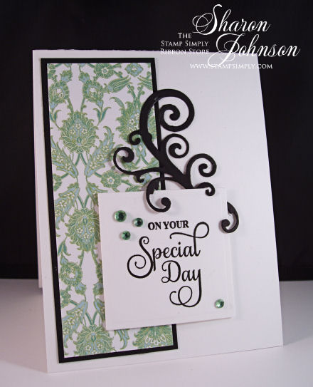
I pulled the colors (green, black and white) from the wedding invitation, which was also quite simple in design.
Paper: Best Friends by Webster’s Pages
Die: Spellbinders Jewel Flowers and Flourishes, Square Nesties
Stamp: Enjoy the Day Vintage Labels Four, a large clear set by JustRite
Miscellaneous: Kaisercraft Rhinestones – Mint, 3D Foam Squares
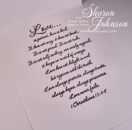
And here’s the inside using the sentiment I love most for the inside of wedding cards.
Stamp: 1 Corinthians, a cling stamp by Our Daily Bread Design
Find all stamps by Our Daily Bread Design here.
Find all Christian/Scripture stamps here.
All items available at The Stamp Simply Ribbon Store, as linked.
____________________
Here’s a quick visual of what I used today:
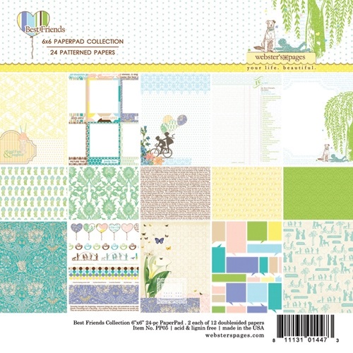
Best Friends by Webster’s Pages
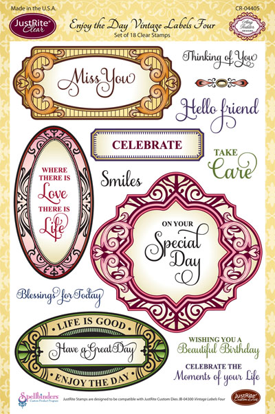
Enjoy the Day Vintage Labels Four – a large clear stamp set by JustRite
This set coordinates with the Vintage Labels Four die.

Jewel Flowers and Flourishes die set – love the variety of options.
All items are available at The Stamp Simply Ribbon Store, as linked.
____________________
If you missed this morning’s post, scroll down or click here to check it out. Darsie has some fabulous Gelato creations to inspire us.
Thanks so much for stopping in.
See you tomorrow!
6 responses so far


Love it!!!
Gorgeous!
Great soothing colors and layout. I LOVE the spellbinders flourish, you can’t beat clean and simple with a few curly cues. TFS
Gorgeous!
Very lovely card.
That black swirl against the negative space really makes this card pop. It leads your eye to the greeting and ties in with the black mat on the DP; thanks for the inspiration. This is a beautiful card.